New Learning Frontend
The frontend of the platform is changing to micro-frontends which allow for rework of an enhanced UI/UX experience, reduction load times and performance updates, and limits scope of the application. Updates to the Learner Profile, Account Settings, and Course Experience pages have shifted all or partially to this new frontend rework. Improvements have also been added enabling learner schedule personalization, course dates and milestones, an updated progress page, team assignment submissions, as well as major updates to the mobile application video experience.
New Course Grade Book Frontend
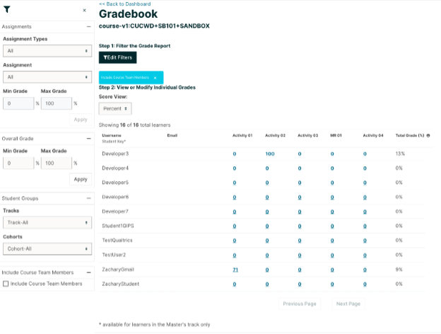
Figure 1: New Frontend Grade book With Filter Menu Expanded
The grade book displays a table, with a row for each learner enrolled in the course, listed by username, and a column for each assignment in the course.
The grade book includes the following features:
- Filtering: There are several options for filtering the data shown on the grade book.
- Assignment Type: only show grades for a certain Assignment Type.
- Assignment: only show grades for a single Assignment.
- Assignment Grade: when filtering by Assignment, only show users with a grade for that assignment within a certain range.
- Overall Grade: only show learners whose total course grade is within a certain range.
- Track: only show learners of a certain enrollment mode (e.g. verified, audit, masters). EducateWorkforce uses the `honor` track mode which allows the learner to earn a certificate of completion.
- Cohort: only show learners in a certain cohort. EducateWorkforce does not use the cohort feature at the moment.
- Include Course Team Members: By default, users with certain course roles (Staff, Admin) will be excluded from grade book results. To include those users, you can select this option, which will include those excluded users in the grade book.
- Searching: You can search for individual learners by their username, using the search field. Searches are case-insensitive.
- Grade Override: You can override the grade that a learner has received for a specific graded subsection.
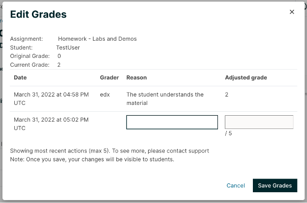
Figure 2: New Frontend Grade Override Interface
- Grade Override: You can override the grade that a learner has received for a specific graded subsection.
What does this new frontend offer over the legacy grade book?
The micro-frontend offers a great deal more granularity when searching for problems, an easy interface for editing grades, an audit trail for seeing who edited what grade and what reason they gave (if any) for doing so.
UsageProblems can be filtered by student as in the legacy grade book, but can also be filtered by scores to see who scored within a certain range, and by assignment types (note: Not problem types, but categories like ‘Exams’ or ‘Homework’).
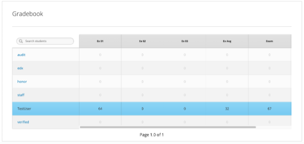
Figure 3: Legacy Grade book
What does the legacy grade book offer that this new grade book frontend does not?
This new frontend does not create any graphs, which the traditional grade book does. It also does not give quick links to the problems for the instructor to visit. It expects the instructor to be familiar with the problems they are grading and which unit they refer to.
The grade book is expected to be much more performant for larger numbers of students as well. The Instructor Dashboard link for the legacy grade book reports that “this feature is available only to courses with a small number of enrolled learners.” (e.g. 200 students) However, this project comes with no such warning.
New Course Project Page
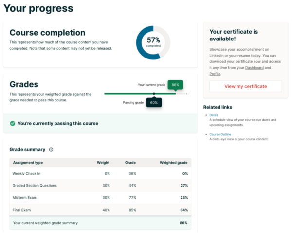
Figure 4: New Frontend Course Progress Interface
New features of this micro-frontend include:
- Course Completion Chart represents all course content completed, both graded and ungraded. This radius chart represents how much of the course content you have completed – that is, the content that’s received a green checkmark. That’s not just graded assignments, but also readings, videos, or practice assignments. This chart did not exist in the legacy course progress interface.
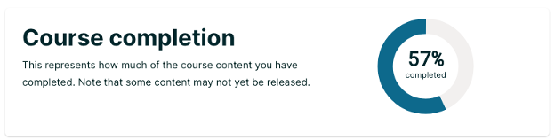
Figure 5: New Frontend Course Progress – Course Completion Char
- Grades Bar Chart displays the current assignment weighted grade compared to the grade required to pass the course to receive a certificate of completion. This chart shows the minimum passing grade on the bottom and your current grade on top. A message below indicates whether you’ve passed the course or not at this time. The more assignments you complete in the course, the more points you earn, the higher this score will grow.
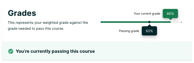
Figure 6: New Frontend Course Progress – Grades Bar Chart
- Grade Summary table shows all assignment types and their weights and makes it clear how your final grade is calculated in the course. The table names each assignment type, its weight, the score in that assignment type, and its weighted grade. Weight means the percentage that an assignment’s score counts towards the total score. This table did not exist in the legacy course progress interface.
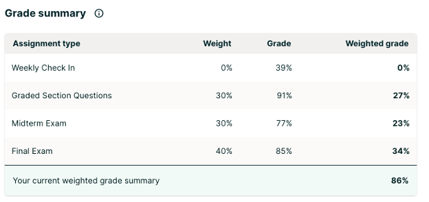
Figure 7: New Frontend Course Progress – Grade Summary Table
- Detailed Grades table outlines each graded assignment chronologically by course section with the learner’s corresponding score. The title of each graded assignment links to the page where you can find that assignment. This interface is similar to how the old progress interface worked but it limits details initially for each assignment score by lesson and offers a way to see details for each problem if necessary.
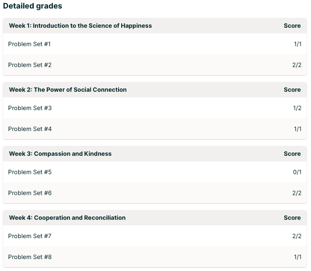
Figure 8: New Frontend Course Progress – Detailed Grades Table
- Certificate Status tells you whether learner earned the certificate yet or not and it provides this indicator all the time, where the legacy interface only displayed it to the learner when they passed the course. This new feature lets you know whether your certificate is available based on your Progress score and enrollment track. If your certificate is available, it includes a link View my Certificate to view it.
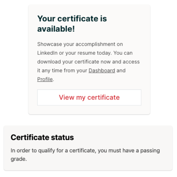
Figure 9: New Frontend Course Progress – Certificate Status (Available, Not Available)
Course Dates and Milestones
Personalized Schedules: Though self-paced courses offer the significant advantage of being available on-demand when a learner wants them, they lack the supporting structure of schedules and timelines. We’ve introduced some of this structure and accountability by creating personalized schedules for each learner, and clearly showing the suggested dates and timeline in the course. These schedules are based off of the course’s expected duration, and customized for each learner’s unique start date. We’ve also retained the advantages of flexibility — should a learner fall behind, they are able to adjust their schedule.
Full Page Dates View: To improve visibility into dates for both instructor-paced and self-paced courses, we have also introduced a dedicated full page view of critical course dates. Each relevant milestone will also link directly to the subsection, to provide easy and quick access. In the future, we will also add the ability for learners to add these dates to their calendars.
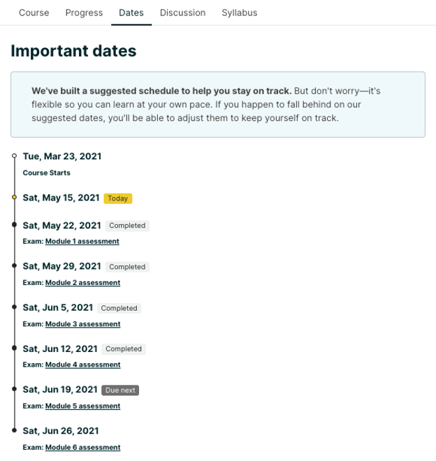
Figure 5: New Frontend Course Dates Interface
Key Terms Dashboard and Xblock
This has been a much-needed feature by EducateWorkforce since we started developing courseware. With new platform development we were able to extend the LMS/CMS applications by including interfaces to upload key terms for a course and display them to the learner through course components and tabbed glossary views. Before this feature was developed, a course developer would need to use web languages like HTML, CSS, and JavaScript when building out key terms and glossary information for the learner. This would require technical skills and could be error prone due to the way the code was structured. Below you will find three different interfaces that show this key term and glossary feature.
Learner: Key term course component
This interface allows the learner to engage with the lesson and module key terms more fluidly. In the previous design term names were presented and the learner had to click the name or textbook icon to go to a separate browser tab to view the glossary or textbook page(s) to locate the definition or descriptive text. With this update the learner can now click on each term and be presented immediately with the term’s definitions, textbook/lesson page hyperlinked locations, and external resource links. With this new interface design were able to provide the learner with a more streamlined approach for interfacing with key terms, eliminating the back and forth of page opens and keeping the learner focused on the content.
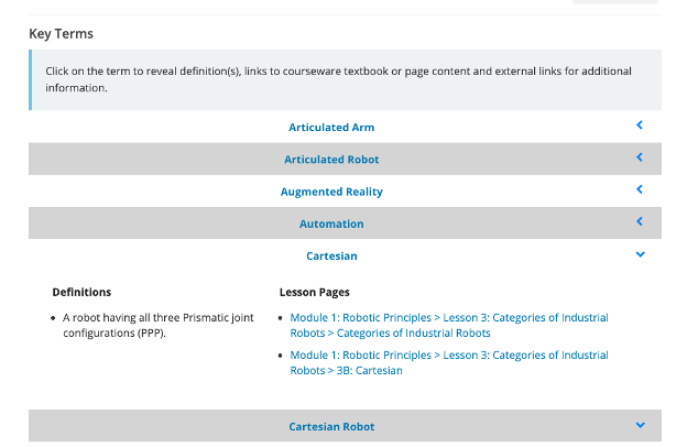
Figure 11: Key Term Course Component Interface.
Learner: Course Glossary
This interface allows the learner to view course key terms and their additional information more fluidly. The interface provides similar functionality to the key term course component in that the learner engages with key term definitions as well as textbook, lesson and reference hyperlinked locations found in the course. The glossary looks at all key terms throughout the course and provides a filter by module if needed.
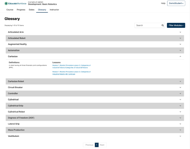
Figure 12: Course Glossary Interface.
Instructor: Key Term Dashboard
This interface provides the instructor with a way to manage key terms for the course either by entering terms in manually or using an external key term templated Excel (XLSX) file for bulk import. The bulk import modal screen provides a way to identify which key terms the instructor would like to add or update if an existing term is found in the course. A term can have multiple definitions and external references. After a course reindex is performed, these terms will include hyperlinked locations to textbook or lesson course locations where additional term’s identification can be found. The instructor could click these hyperlinks to view or share them with the learners as needed.
Drop downs in Breadcrumbs
To enable faster movement through course content, staff users will now see jump navigation selectors to augment the existing course breadcrumb in the learning sequence experience (Learning MFE). With this deployment, a staff user can select a section or subsection, a menu will appear, and the user can jump to a particular unit within a course. Additionally, the breadcrumbs displayed at the top of a page in the legacy experience were organized by Course -> Sequence -> Unit -> Content Block Title, but in the new MFE breadcrumbs only include Course -> Sequence -> Unit. This removes visual clutter of having the same title repeated in a small space on the page.
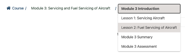
Figure 13: Course Breadcrumb Interface.
Learner Profile Frontend
A complete rewrite of the learner profile experience was completed with new micro-frontend service implementation. This new experience provides improved visibility controls and new optional fields that can be shown on the profile.
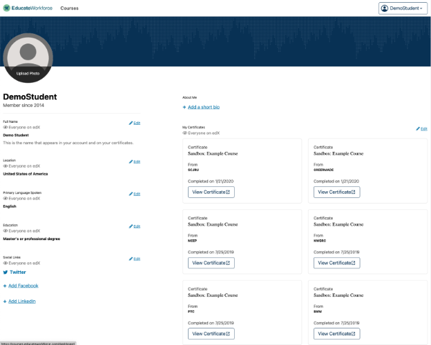
Figure 14: Learner Profile Interface.
Account Settings Frontend
A new Account micro-frontend now also powers an updated account settings experience on the platform. The account settings page can now be more easily extended with plugins, and all features available on the previous account settings page were migrated over to this updated experience.
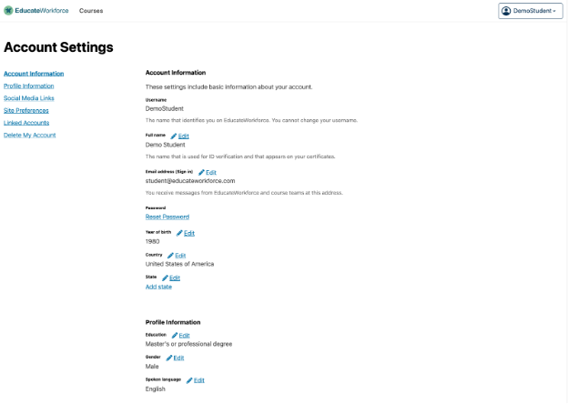
Figure 15: Account Settings Interface.